
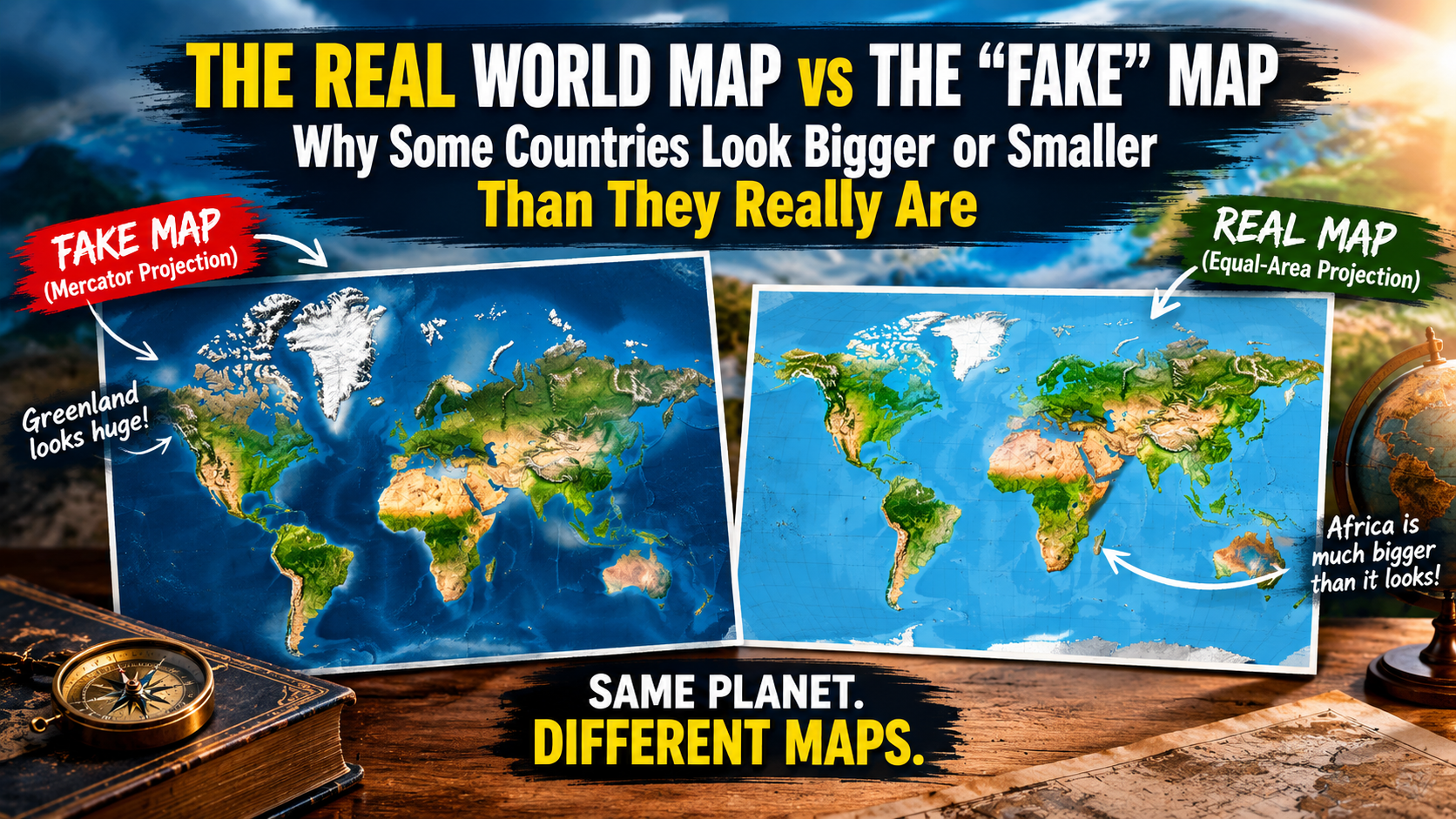
At first glance, the image looks like a simple comparison between a “Fake Map” and a “Real Map”. But the story behind it is far more fascinating.
The truth is that there is no single flat world map that can show our planet with perfect size, shape, distance and direction all at once. Earth is roughly spherical, while a map is usually printed on a flat surface. The moment we flatten a globe, some form of distortion becomes unavoidable.
So, are traditional world maps actually “FAKE”? Not exactly. They are different mathematical representations of the Earth, designed for different purposes.
Why Does the World Look So Different on Different Maps?: The most famous example is the Mercator projection, introduced by Gerardus Mercator in 1569. It became extremely useful for navigation because it preserves angles and makes lines of constant compass direction appear as straight lines. For sailors, this was enormously valuable.
But there is a catch. As you move towards the North and South Poles, land areas become increasingly enlarged on a Mercator-style map.
That means countries such as Greenland can appear dramatically larger than they actually are compared with countries around the Equator. This is where many viral “real map vs fake map” images come from.
Greenland Is the Classic Example: On many familiar world maps, Greenland looks enormous — sometimes appearing comparable with Africa. In reality, Africa is vastly larger than Greenland. Africa covers roughly 30 million square kilometres, while Greenland is about 2.2 million square kilometres.
So Africa is more than ten times the size of Greenland. The dramatic difference isn’t because the traditional map is deliberately lying. It is a consequence of the projection being used.
Why Russia Looks Absolutely Massive?:Russia stretches across an enormous part of the Northern Hemisphere, so its true size is already impressive. However, on a Mercator projection, its territory becomes even more visually exaggerated because much of Russia lies at relatively high northern latitudes.
The same effect influences countries such as:
- Canada.
- Norway.
- Sweden.
- Finland.
- Iceland.
- Russia.
Meanwhile, large countries closer to the Equator can look less dominant than their actual land area would suggest.
Africa Is One of the Biggest Victims of Map Distortion: Perhaps the most important lesson from these comparisons is Africa. On many conventional maps, Africa doesn’t appear as dominant as its real landmass deserves.
Yet the continent is enormous.
Africa could accommodate several large countries from other parts of the world within its boundaries, which is why equal-area map projections can be so eye-opening. This is also why maps aren’t merely decorative objects. The projection we choose can influence how we mentally understand geography.
So Is the “Real Map” in the Picture Actually Real?: This is where the viral graphic needs a little correction.The bottom map labelled “REAL MAP” should not literally be treated as the one true map of Earth. It is better described as a map using a different projection that attempts to represent land area more accurately.
Equal-area projections are designed so that countries retain their correct relative areas.However, they may distort other properties such as:
- Shape.
- Direction.
- Distance.
- Appearance of continents.
- Relative angles.
In other words, you don’t get something for nothing. Improve area accuracy, and you may sacrifice shape. Improve navigation, and you may sacrifice area.
Why Don’t We Just Use One Perfect World Map?: Because a perfect flat world map doesn’t exist. Imagine taking an orange and trying to flatten its peel onto a table without stretching, tearing or folding it.
You simply can’t do it perfectly. Earth works in much the same way. Cartographers therefore create different map projections, each designed around a particular purpose.
Mercator Projection: Excellent for traditional navigation and preserving local angles, but greatly exaggerates areas towards the poles.
Equal-Area Projections: Better for comparing the actual size of countries and continents, although shapes can look unusual.
Robinson Projection: Designed as a compromise, producing a visually pleasing representation of the world while reducing extreme distortion.
Winkel Tripel: Another compromise projection designed to reduce several types of distortion and widely used for general world maps.
What About Nepal 🇳🇵 ?: Nepal is a particularly interesting example because it sits relatively close to the Himalayas and far from the Equator. On a global map, Nepal can appear tiny — and geographically it is a relatively small country compared with giants such as China, India, Russia or Canada.
But its small appearance doesn’t mean its geographical importance is small. Nepal contains an extraordinary vertical range, from the lowlands of the Terai to the summit of Mount Everest, making it one of the world’s most dramatic landscapes in terms of elevation. A flat map can never completely communicate that three-dimensional reality.
The Biggest Lesson: A Map Is a Model, Not the Earth. This is perhaps the most important point. When you look at a world map, you aren’t looking at Earth itself. You’re looking at a mathematical model of Earth. Every projection makes choices.
- One map might prioritise – Navigation: Accurate directions and angles.
- Another might prioritise – Area: Accurate comparisons between countries.
- Another might prioritise – Appearance: A balanced-looking world map for education or general use.
So calling one map “FAKE” and another “REAL” is catchy for social media, but geographically it is misleading.
Why Map Projections Matter More Than You Think?: Map distortion isn’t just an interesting geographical trick. Maps have shaped the way generations of people imagine the world.
If a country appears enormous on a classroom wall, we may subconsciously assume it has a much greater physical presence than it actually does. Likewise, countries closer to the Equator can appear surprisingly small on certain projections.
This doesn’t mean cartographers are trying to deceive us. It means the way information is displayed changes how we perceive that information. That’s an important lesson not only for geography, but for data visualization in general.
Final Verdict: Fake Map or Distorted Map?: The viral image gets one important thing right: some familiar world maps seriously distort the apparent size of countries. But calling the upper map a “fake map” isn’t technically accurate.
The better description is: It is a different map projection with different priorities. There is no completely distortion-free flat map of the Earth.
So next time you look at a world map, remember this: the planet hasn’t changed size — the mathematics used to display it has and that is why a country that looks gigantic on your wall might be considerably smaller in the real world, while another that looks surprisingly modest could be far larger than you imagined.